- Buenas prácticas
- Metodología BEM
- Sass
- Custom Property (css variables)
- Pasos previos
- Reset de CSS
- Defensive CSS
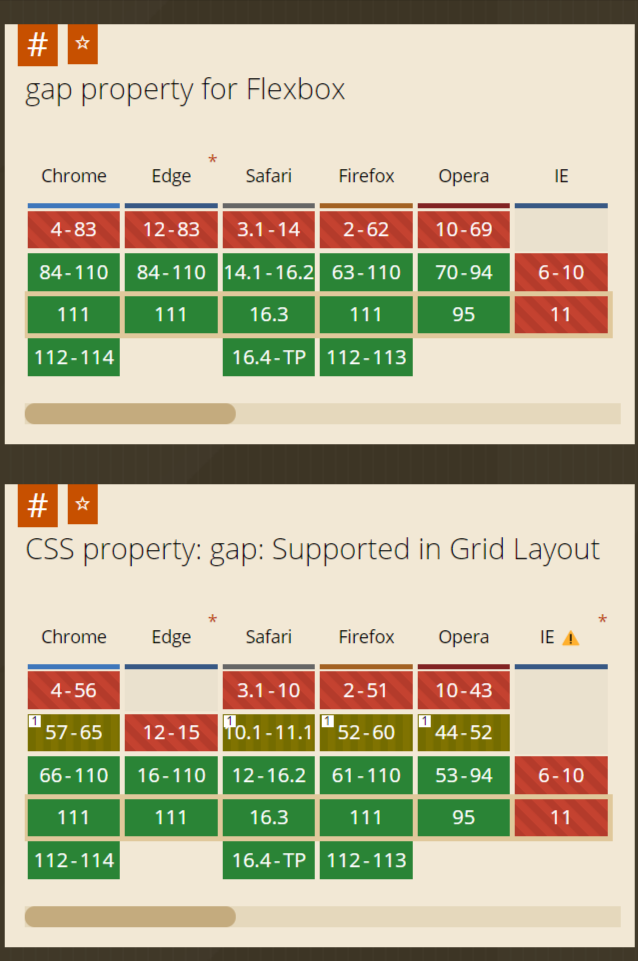
- Soporte a navegadores
- Analizar diseños / dudas
- Dibujar en papel layout
- Identificar componentes
- HTML con reset de estilos
- Estilos para tipografías y cajas
- Reglas CSS
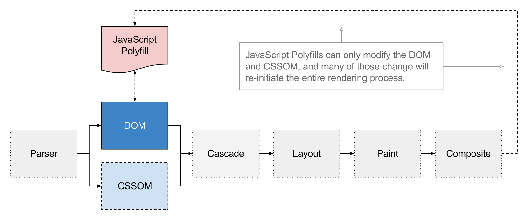
Orden de la cascada
- Browser styles
- User Styles
-
Author Styles
- @layer theme [...]
- Non-Layered Styles
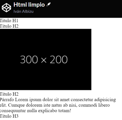
See the Pen CAP - Html limpio by Iván Albizu (@ivan_albizu) on CodePen.

- Tratar de evitar "roturas" de CSS por diferentes casos de uso Ahmad Shadeed
- Transpilación
- Indentación (nesting)
- Variables
- Operador "&"
- Mixins
- Maps
- Funciones
- Los navegadores reconocen CSS
- Requiere herramienta intermedia que transforme SCSS a CSS
- Más mantenible. Se dota de características propias de programación: variables, funciones, mapas...
              .nav .list {
                margin: 0;
                padding: 0;
              }
              .nav .list .list-item {
                display: inline-block;
              }
              .nav .list {
                margin: 0;
                padding: 0;
              }
              .nav .list .list-item {
                display: inline-block;
              }
              .nav {
                .list {
                  margin: 0;
                  padding: 0;
                }
              }
              .nav .list .list-item {
                display: inline-block;
              }
              .nav {
                .list {
                  margin: 0;
                  padding: 0;
                }
              }
              .nav .list .list-item {
                display: inline-block;
              }
              .nav {
                .list {
                  margin: 0;
                  padding: 0;
                }
                .list .list-item {
                  display: inline-block;
                }
              }
              .nav {
                .list {
                  margin: 0;
                  padding: 0;
                  .list-item {
                    display: inline-block;
                  }
                }
              }
              $color-primary: #cc0; //definición de variable SASS
              .nav {
                color: $color-primary; //uso de variable SASS
              }
              .logo {
                outline: 1px solid $color-primary; //uso de variable SASS
              }
              $color-primary: #cc0; //definición de variable SASS
              .nav {
                color: $color-primary; //uso de variable SASS
              }
              .logo {
                outline: 1px solid $color-primary; //uso de variable SASS
              }
              $color-primary: #cc0; //definición de variable SASS
              .nav {
                color: #cc0; //lo que le llega al navegador
              }
              .logo {
                outline: 1px solid #cc0; //lo que le llega al navegador
              }
See the Pen CAP - Sass variables by Iván Albizu (@ivan_albizu) on CodePen.
              .header {
                // some code
                &__nav {
                  // perhaps, more code
                }
              }
              .header {
                // some code
              }
              .header__nav {
                // perhaps, more code
              }
              .link {
                // some code
                &.is-active {
                  // perhaps, more code
                }
              }
              .link {
                // some code
              }
              .link.is-active {
                // perhaps, more code
              }
              @mixin theme($theme: DarkGray) {
                background: $theme;
                box-shadow: 0 0 1px rgba($theme, .25);
                color: #fff;
              }
              @mixin theme($theme: DarkGray) {
                background: $theme;
                box-shadow: 0 0 1px rgba($theme, .25);
                color: #fff;
              }
              .info {
                @include theme;
              }
              .alert {
                @include theme($theme: DarkRed);
              }
              @mixin theme($theme: DarkGray) {
                background: $theme;
                box-shadow: 0 0 1px rgba($theme, .25);
                color: #fff;
              }
              .info {
                background: DarkGray;
                box-shadow: 0 0 1px rgba(169, 169, 169, 0.25);
                color: #fff;
              }
              .alert {
                background: DarkRed;
                box-shadow: 0 0 1px rgba(139, 0, 0, 0.25);
                color: #fff;
              }
              $theme-colors: (
                "primary": $primary,
                "danger": $danger
              );
              body {
                background-color: map-get($theme-colors, "primary");
              }
              // el uso de map-get suele ser mediante función auxiliar para
              // evitar posibles errores al no encontrar la 'key' o 'values' inesperados
              // ejemplo: https://gist.github.com/lewismcarey/de2a70fe93ab235ba103
Ejemplo de uso, no entramos en detalles
See the Pen fluid css by Iván Albizu (@ivan_albizu) on CodePen.
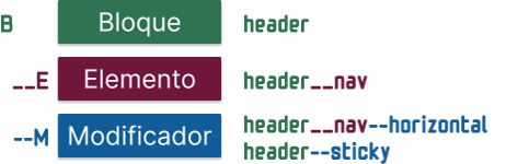
- Basado en el nombrado de clases
- Evitar colisionado de estilos
- Aporta semántica
- B → Bloque
- E → Elemento → __elemento
- M → Modificador → --modificador
See the Pen CAP - BEM menu by Iván Albizu (@ivan_albizu) on CodePen.
- Definición
- Ámbito
- Registro
- Ejemplos
              --main-color: #32022c; // definición de Property y asignación de valor
              color: var(--main-color);
              border-color: var(--main-color, purple);
              --main-color: #32022c; // definición de Property y asignación de valor
              color: var(--main-color); // uso de Property
              border-color: var(--main-color, purple);
              --main-color: #32022c; // definición de Property y asignación de valor
              color: var(--main-color); // uso de Property
              border-color: var(--main-color, purple); // uso de Property con fallback
              // en cualquier regla CSS tendrá este valor
              // salvo que se sobreescriba en otra regla
              :root {
                --main-color: #32022c;
              }

              // nuevo valor para la Property
              // para cualquier elemento que esté dentro de ".nav"
              // salvo que se sobreescriba en otra regla hija
              .nav {
                --main-color: #022;
              }
              // en cualquier regla CSS tendrá este valor
              // salvo que se sobreescriba en otra regla
              :root {
                --main-color: #32022c;
              }

              // nuevo valor para la Property
              // para cualquier elemento que esté dentro de ".nav"
              // salvo que se sobreescriba en otra regla hija
              .nav {
                --main-color: #022;
                .item {
                  --main-color: #bbb022;
                }
              }
              @property --coordinate-x {
                initial-value: 50%;
                inherits: true;
                syntax: '<percentage>';
              }
See the Pen Transition for custom Property (css Vars) by Iván Albizu (@ivan_albizu) on CodePen.
              :root {
                --t-delay-btn: .3s;
                --t-duration-btn: .5s;
              }
              :root {
                --t-delay-btn: .3s;
                --t-duration-btn: .5s;
              }
              .btn {
                transition: all var(--t-duration-btn) linear var(--t-delay-btn);
                &:hover,
                &:focus {
                  transition: all var(--t-duration-btn) linear var(--t-delay-btn);
                }
              }
              :root {
                --t-delay-btn: .3s;
                --t-duration-btn: .5s;
              }
              @media screen and (prefers-reduced-motion: reduce) {
                :root {
                  --t-delay-btn: 0.01ms;
                  --t-duration-btn: 0.01ms;
                }
              }
              .btn {
                transition: all var(--t-duration-btn) linear var(--t-delay-btn);
                &:hover,
                &:focus {
                  transition: all var(--t-duration-btn) linear var(--t-delay-btn);
                }
              }
See the Pen Prefers Reduced Motion by Iván Albizu (@ivan_albizu) on CodePen.
              :host button:hover,
              :host button:focus-within {
                outline: 2px solid var(--color-tab-active-background, #5A3A31);
              }
              :host .js-active-tab-bg {
                background-color: var(--color-tab-active-background, #5A3A31);
              }
See the Pen WebComponent Tabs with Slots by Iván Albizu (@ivan_albizu) on CodePen.
Ramas:
- feature/01-html
- feature/02-css-cajas
- feature/03-desktop
- feature/04-pixel-perfect
- @container CSS
- Capas @layer
- CSS Houdini
- Funciones CSS + pseudo clases
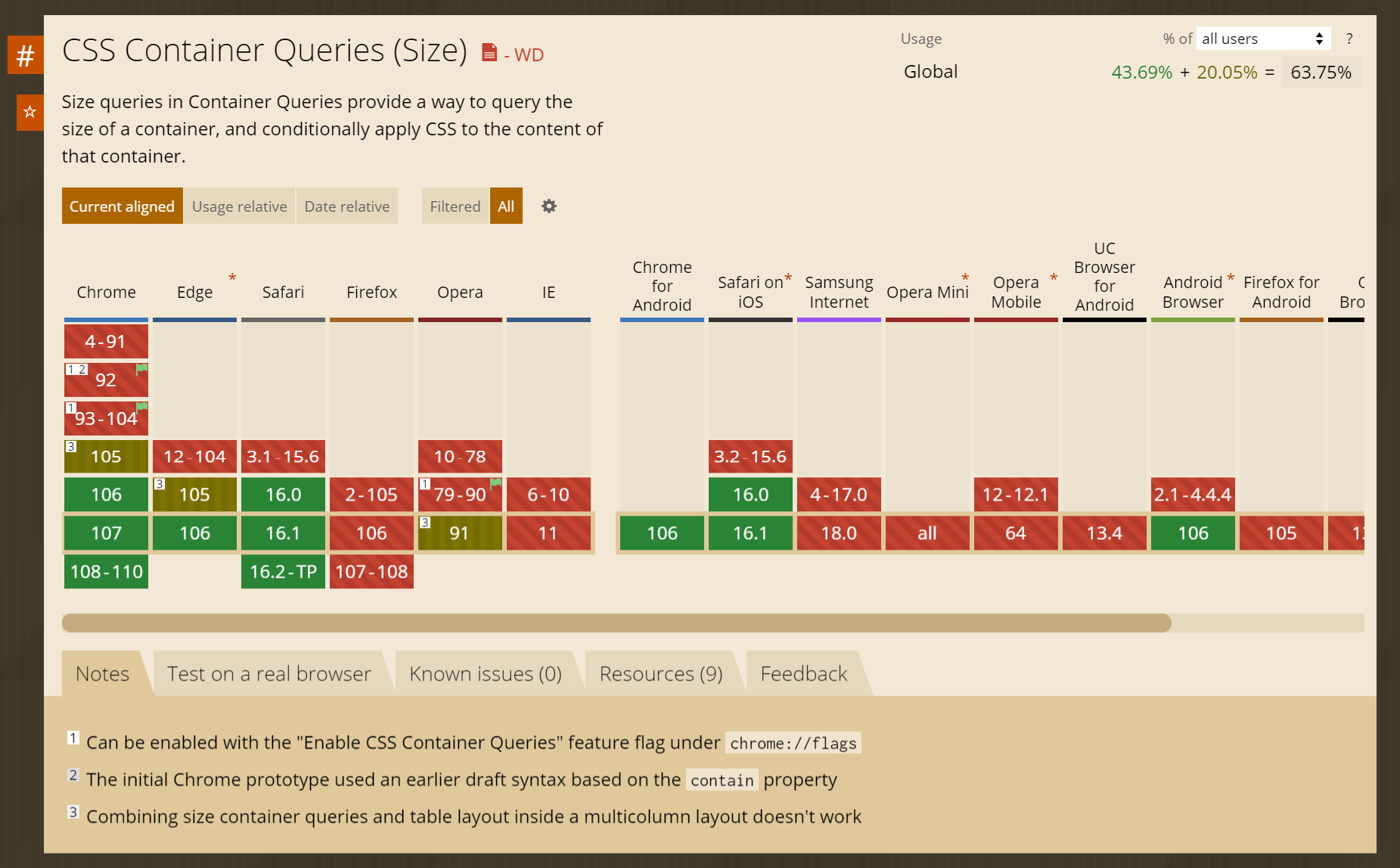
- ¿Qué es @container?
- Estado actual
- Definición de @container
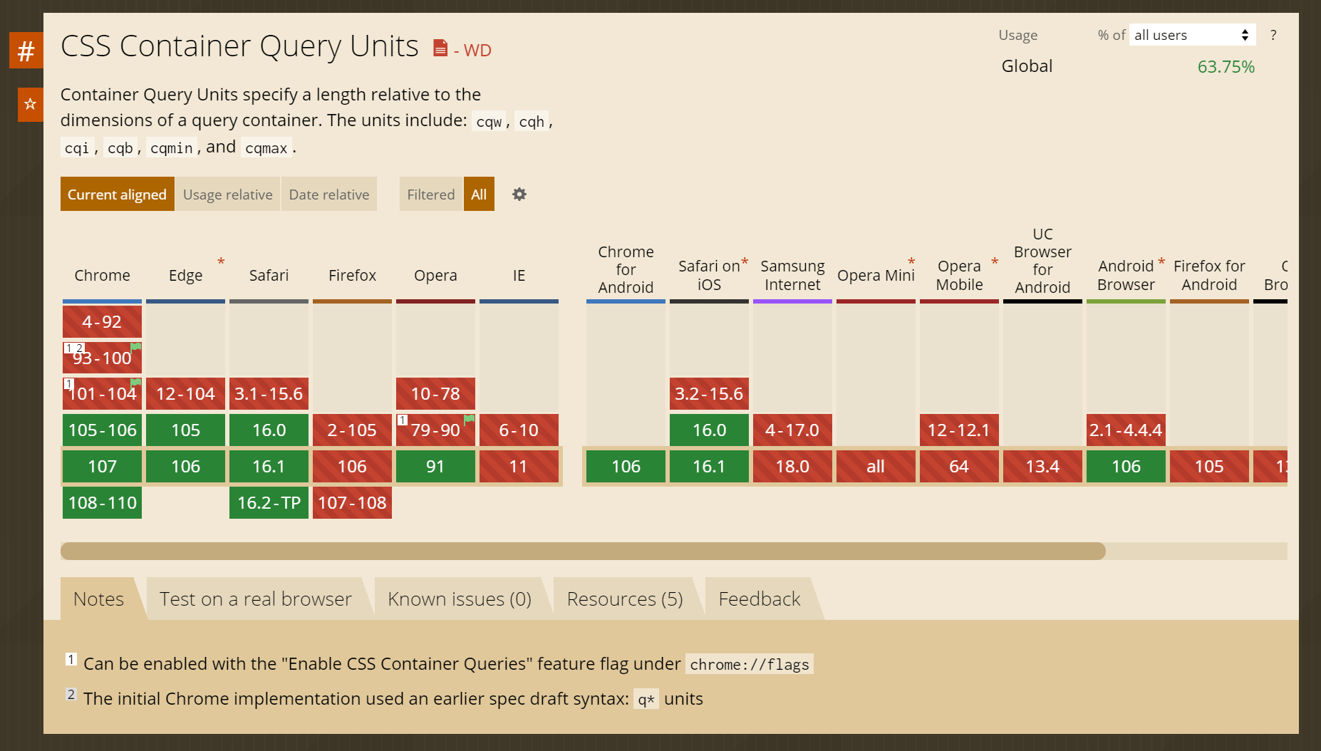
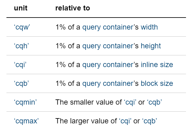
- Unidades propias de @container
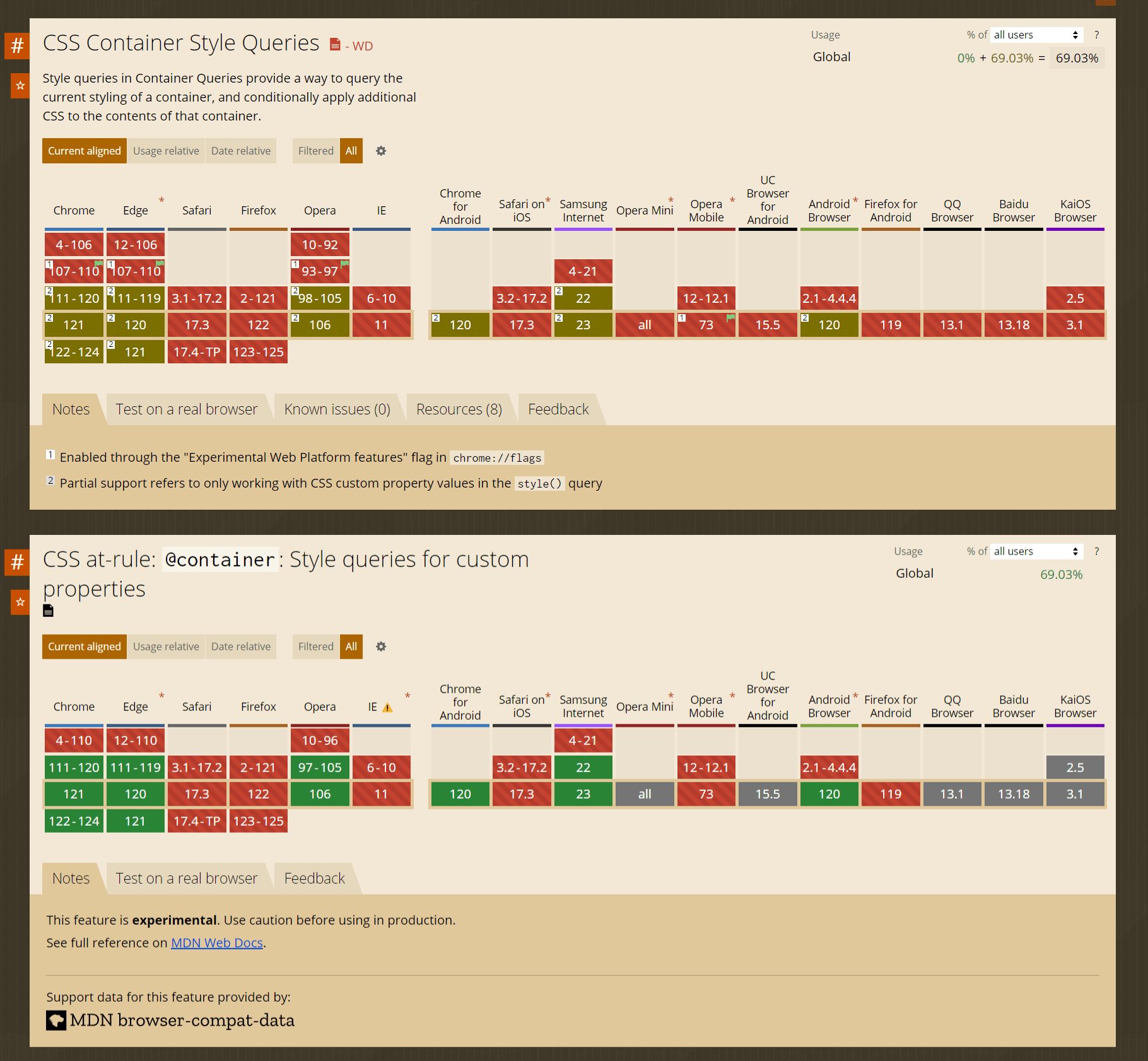
- @container style()
- Nested @container
              @supports not (container: inline-size) {
                .warning {
                  display: block;
                }
              }
              @supports (selector(:has(*))) {
                body {
                  background-color: red
                }
              }
                [data-container="btn"] {
                  container-type: inline-size;// size | inline-size | normal
                  container-name: btns;
                  //container: <container-name> / <container-type>;
                }
                .btn-groups {
                  display: flex;
                  flex-direction: column;
                }
                @container btns (min-width: 300px) {
                  .btn-groups {
                    flex-direction: row;
                  }
                }
                @container (width > 900px) {
                  .card {
                    --bg-color: brown;
                    --padding: 16px;
                  }
                }
                .title-card {
                  font-size: clamp(1rem, 3cqi + 1rem, 4rem);
                  line-height: 1.1;
                  margin-bottom: 1rem;
                }
              @container style(--type: primary) {
                .card {
                  border: 0.5rem dotted currentColor;
                }
                @container style(--sub-type: narrow) {
                  .card {
                    border-width: 0.2rem;
                  }
                }
                @container style(--sub-type: wide) {
                  .card {
                    border-width: 1rem;
                  }
                }
              }
              @container style(--type: primary) or style(--type: secondary) {
                // some styles
              }
              @container card (min-width: 600px) and style(--responsive: true) {
                .card {
                  outline: 2px solid currentColor;
                  outline-offset: -8px;
                }
              }
See the Pen CSS @container by Iván Albizu (@ivan_albizu) on CodePen.
See the Pen Container Queries + Container Units by Iván Albizu (@ivan_albizu) on CodePen.
See the Pen Untitled by Iván Albizu (@ivan_albizu) on CodePen.
See the Pen CSS @containers | nested + layers by Iván Albizu (@ivan_albizu) on CodePen.
MDN - container queries

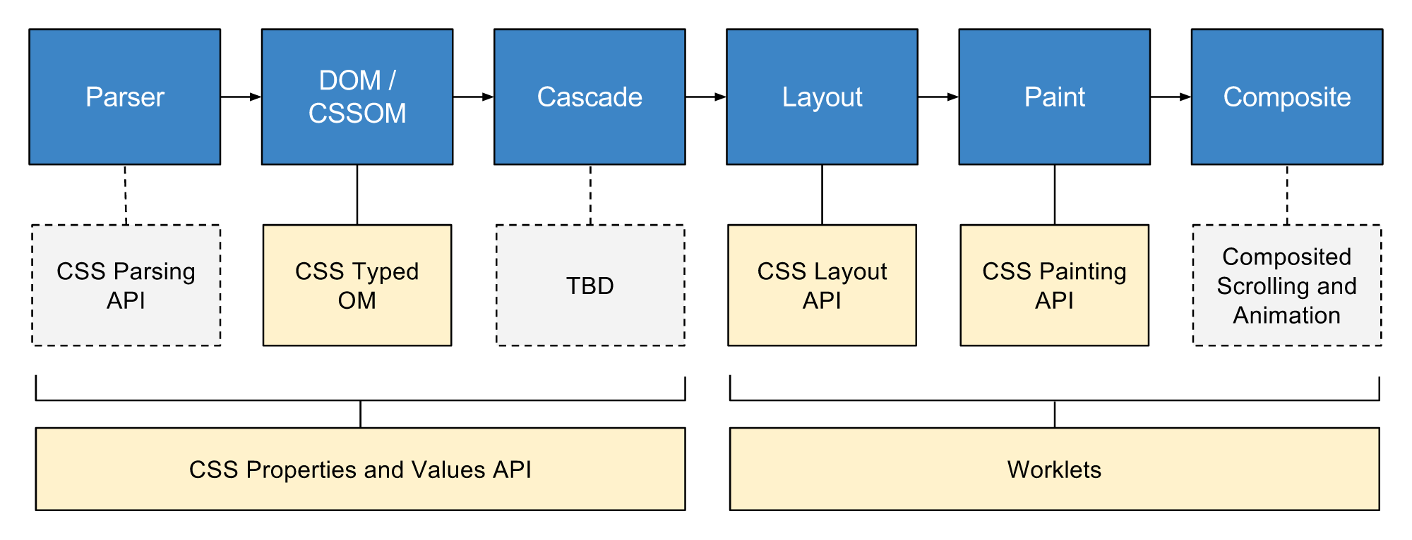
Un gran poder conlleva una gran responsabilidad
- Grupo de APIs que da acceso directo a CSSOM
- Mediante worklets
- Permite escribir código que el navegador puede analizar como CSS
- Crear nuevas funcionalidades CSS sin esperar a que se implementen de forma nativa en los navegadores
Ampliar información de manera más técnica y con más ejemplos
Charla en youtube by Joan LeónPresentación by Joan León
- document.styleSheets
- CSSStyleSheetList
- CSSStyleSheet
- CSSRuleList
- CSSStyleRule
- CSSStyleDeclaration
- CSS Properties and Values API
- CSS Typed OM
- CSS Painting API
- Worklets
- CSS Layout API
- CSS Parser API
              class BtnPulse {
                paint(ctx, size, props) {
                  // Code
                }
              }

              registerPaint('btn-pulse', BtnPulse);
              // Opción para usarlo en Codepen
              (async () => {
                if (typeof CSS === 'undefined' || !('paintWorklet' in CSS)) {
                  await import("https://unpkg.com/css-paint-polyfill");
                }

                const paintModule = URL.createObjectURL(new Blob(
                  [ document.querySelector('[type="houdini/paint-worklet"]').textContent ],
                  { type: "text/javascript" }
                ));
                await CSS.paintWorklet.addModule(paintModule);
              })()
              @supports (background: paint(something)) {
                .element {
                  background: tomato paint(btn-pulse);
                  border-image: paint(another-houdini-definition);
                }
              }
              registerPaint('btn-pulse', class {
                static get contextOptions() { }

                static get inputArguments() { }

                static get inputProperties() { }

                _paintCircles(ctx, fillStyle, strokeStyle, x, y, rad)  { }

                paint(ctx, size, props) { }
              })
              registerPaint('btn-pulse', class {
                static get contextOptions() { }

                static get inputArguments() { }

                static get inputProperties() {
                  return []
                }

                _paintCircles(ctx, fillStyle, strokeStyle, x, y, rad)  { }

                paint(ctx, size, props) { }
              })
              registerPaint('btn-pulse', class {
                static get contextOptions() { }

                static get inputArguments() { }

                static get inputProperties() {
                  return [
                    '--x',
                    '--y',
                    '--rad',
                    '--pulse-rad',
                    '--fill',
                    '--pulse-stroke-color'
                  ]
                }

                _paintCircles(ctx, fillStyle, strokeStyle, x, y, rad) { }

                paint(ctx, size, props) { }
              })
              registerPaint('btn-pulse', class {
                static get contextOptions() { }

                static get inputArguments() { }

                static get inputProperties() {
                  return [
                    '--x',
                    '--y',
                    '--rad',
                    '--pulse-rad',
                    '--fill',
                    '--pulse-stroke-color'
                  ]
                }

                _paintCircles(ctx, fillStyle, strokeStyle, x, y, rad) {}

                paint(ctx, size, props) { }
              })
              registerPaint('btn-pulse', class {
                static get contextOptions() { }

                static get inputArguments() { }

                static get inputProperties() {
                  return [
                    '--x',
                    '--y',
                    '--rad',
                    '--pulse-rad',
                    '--fill',
                    '--pulse-stroke-color'
                  ]
                }

                _paintCircles(ctx, fillStyle, strokeStyle, x, y, rad) {
                  ctx.beginPath()
                  ctx.fillStyle = fillStyle
                  ctx.strokeStyle = strokeStyle
                  ctx.arc(x, y, rad, 0, 2 * Math.PI)
                  ctx.fill()
                  ctx.stroke()
                }

                paint(ctx, size, props) {
                  const x = props.get('--x')
                  const y = props.get('--y')
                  const rad = props.get('--rad')
                  const fill = (props.get('--fill')).toString()
                  const pulseRad = props.get('--pulse-rad')
                  const pulseStrokeColor = (props.get('--pulse-stroke-color')).toString()

                  this._paintCircles(ctx, fill, '#fff', x.value, y.value, rad.value)
                  this._paintCircles(ctx, 'transparent', pulseStrokeColor, x.value, y.value, pulseRad.value + rad.value)
                }
              })
See the Pen CSS Houdini Paint API - bezierCurve by Iván Albizu (@ivan_albizu) on CodePen.
- Definición
- Estado actual
- ¿Para que sirven?
- Importación / nested / non-layered
              @charset "UTF-8"
              @layer theme {rules};
              @layer theme;
              @layer theme, layout, utilities;
              @layer {rules}

- Más control sobre como se aplica la cascada
- Evitar selectores complejos
- Evitar técnicas
!important
- Browser styles
- User Styles
-
Author Styles
- @layer theme
- @layer layout
- @layer utilities
- Non-Layered Styles
              @charset "UTF-8";
              @layer reset;
              @import url("bootstrap.css");
              @import url("bootstrap.css") layer(framework);
              @layer outer {
                @layer inner {
                  .button {
                    color: red;
                  }
                }
              }

              @layer outer.inner {
                .another {
                  color: green;
                }
              }
              @layer base {
                #button.super-specific {
                  color: red;
                }
              }
              button {
                color: green;
              }
Anidaciones
MDN @layer

- calc(), min(), max()
- clamp()
- Pseudo clases funcionales :is() :where() :has() :not()
| Display state | :fullscreen | :modal | :picture-in-picture |
| Linguistic | :dir() | :lang() |
| Input pseudo-classes | :autofill | :enabled | :disabled | :read-only | :read-write | :placeholder-shown | :default | :checked | :indeterminate | :blank | :valid | :invalid | :in-range | :out-of-range | :required | :optional | :user-invalid |
| Location | :any-link | :link | :visited | :local-link | :target | :target-within | :scope |
| DOM structure | :root | :empty | :nth-child | :nth-last-child | :first-child | :last-child | :only-child | :nth-of-type | :nth-last-of-type | :first-of-type | :last-of-type | :only-of-type |
| User action | :hover | :active | :focus | :focus-visible | :focus-within |
| Functional | :is() | :not() | :where() | :has() |
Fuente: MDN
- Display Modes
- Windows Contrast Theme
- System Colors. Nombre de colores
- Propiedades afectadas
- Propiedades con comportamiento especial
- Detectar preferencias de contraste
- Y ahora... ¿qué?
- Dark Mode
- Reduced Motion Mode
- Invert Colors
- Increase Contrast
- Text Contrast
- Reduce Transparency
- Reader Mode
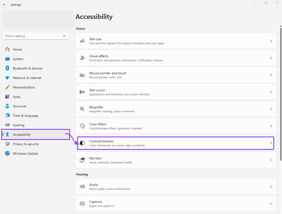
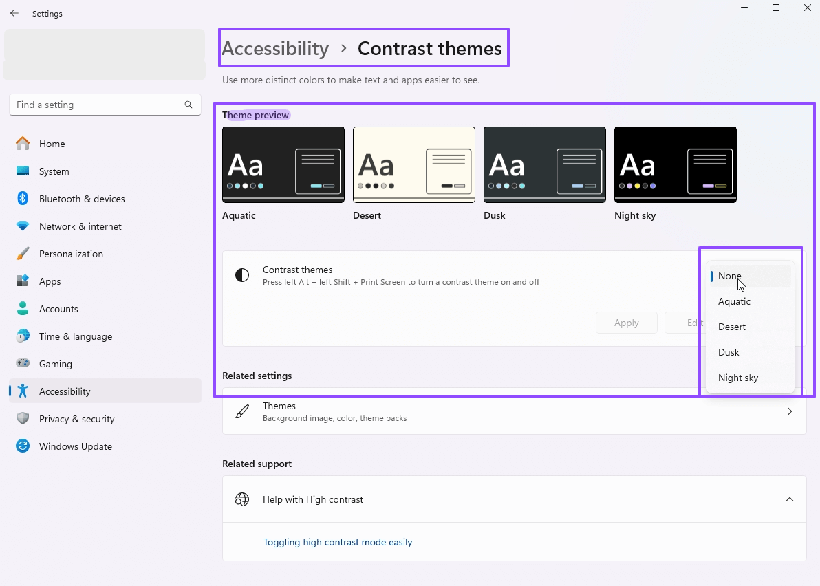
- Windows Contrast Themes
Windows 10: High Contrast
Windows 11: Contrast Themes
MacOS: Accessibility > Displays > Increase contrast in MacOS
                Canvas / CanvasText (*): Background color / Regular text color
                Link (*): Link color
                ButtonFace / ButtonText (*): Button background color / Button text color
                Field / FieldText
                SelectedItem / SelectedItemText
                AccentColor / AccentColorText
                ActiveText / VisitedText
                Highlight / HighlightText (*): Selected text background color / Selected text color
                GrayText (*) (text color disabled)
                Mark / MarkText

              (*) Nombre de colores seguros y comunes
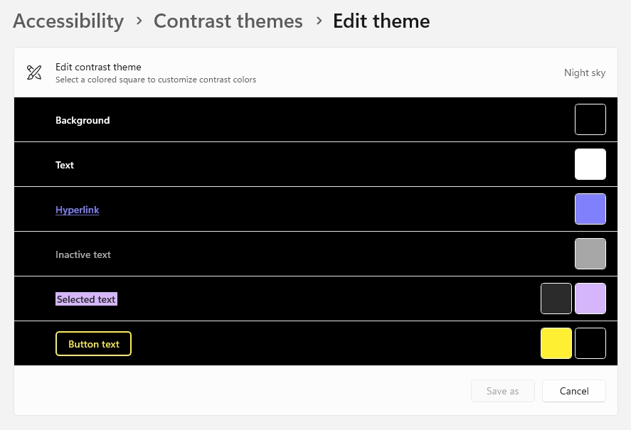
See the Pen CSS4 System colors: forced-colors: active by Iván Albizu (@ivan_albizu) on CodePen.
                color
                background-color
                text-decoration-color
                text-emphasis-color
                border-color
                outline-color
                column-rule-color
                -webkit-tap-highlight-color
                SVG fill attribute
                SVG stroke attribute
                box-shadow: forzado a 'none'
                text-shadow: forzado a 'none'
                background-image: forzado a 'none' excepto url-based
                color-scheme: forzado a 'light dark'
                scrollbar-color: forzado a 'auto'
                @media (forced-colors: active) {
                  .selector {
                    // +-equivale a "none" (currentColor, inherit)
                    // +info: https://developer.mozilla.org/en-US/docs/Web/CSS/forced-color-adjust#preserve-parent-color
                    forced-color-adjust: preserve-parent-color;
                    //forced-color-adjust: none; //Con firefox puede dar problemas
                    &__hijo {
                      forced-color-adjust: auto;
                    }
                  }
                }
                const forced_colors = matchMedia('(forced-colors: active)');
                if ( forced_colors ) {
                  // User has constrast theme active
                }
See the Pen Untitled by Iván Albizu (@ivan_albizu) on CodePen.
- Usa HTML semántico
- Usa etiquetas correctas
- Si quieres enlaces, usa
<a>Enlace</a> - Si quieres acciones, usa
<button>Botón</button> - [...]
- Si quieres enlaces, usa
- Evita dar semántica a elementos "sin semántica" con ARIA/ROLE (gracias al punto 1.)
- Tómate un tiempo, y una cerveza 0.0, antes de maquetar a lo loco. Los TOKENS CSS molan
-
Tips CSS:
- Botones con bordes, y si el diseño no los tiene, valorar si es posible
border-color: transparent; - Intenta dejar el "underline" de enlaces normales, pero si es obligado, valora usar
text-decoration-color: transparent;en lugar detext-decoration: none; - No eliminar el focus-visible
- Sugerir uso de
media="(forced-colors: active)"en los<source>de<picture>
- Botones con bordes, y si el diseño no los tiene, valorar si es posible
- 51% de personas con baja visión usan Contrast Mode
- WCAG
- 1.4.8: Visual Presentation (AAA)
1.- Foreground and background colors can be selected by the user. - 1.4.1 Use of Color (A)
Color is not used as the only visual means of conveying information (example PEN)
- 1.4.8: Visual Presentation (AAA)
- Igualdad de oportunidades
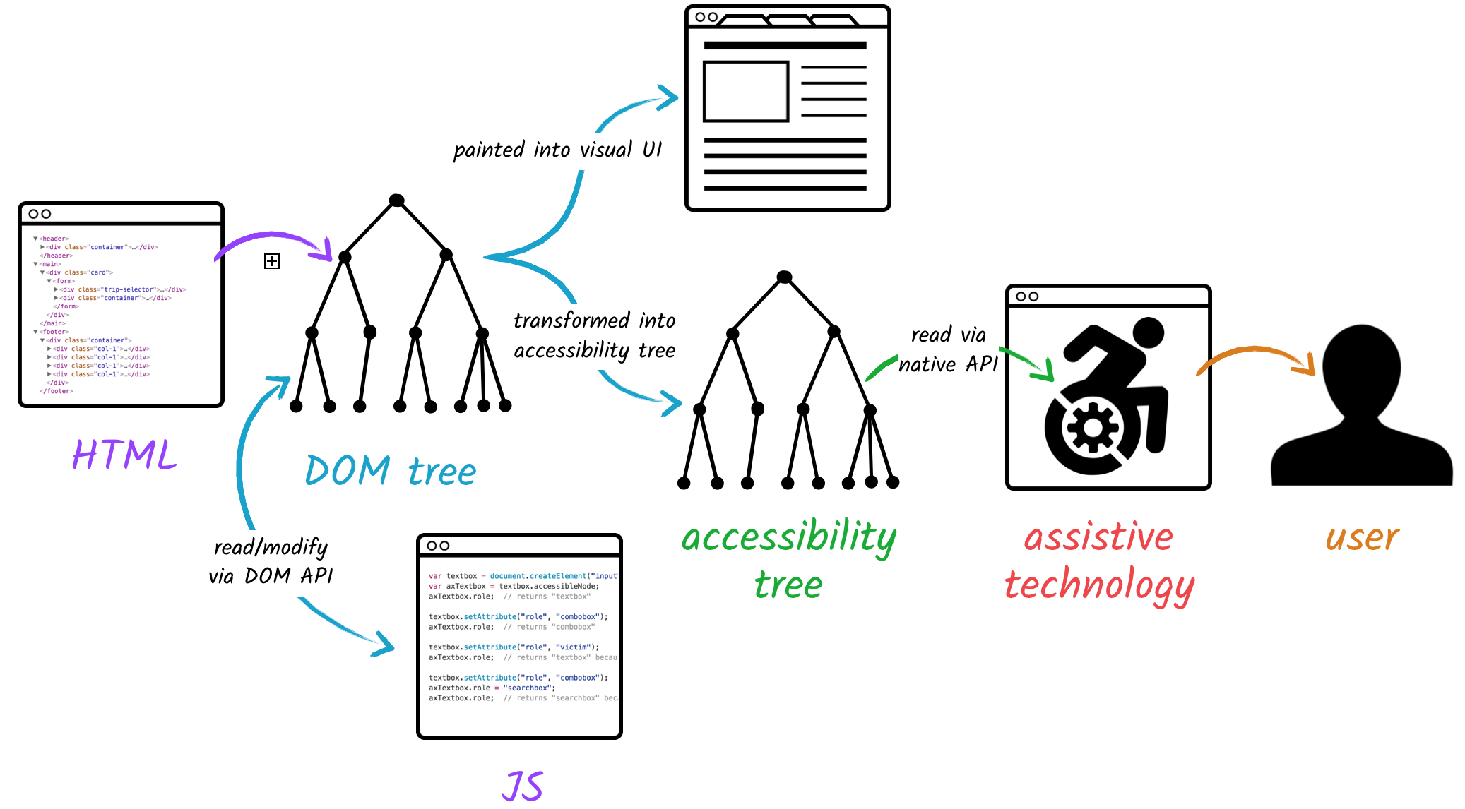
- Accessibility tree
- ¿Qué es nombre accesible?
- Importancia de accName
- Formas de establecer accName
- Orden en que se computa accName
- WCAG
| role |
<button> <link> [...]
|
| name |
Contenido
|
| description |
Contenido ayuda (exigencias para contraseñas)
|
| state |
checkbox (checked/unchecked)
button (pressed/unpressed) |
- Nombre o nombre accesible (accName) de un elemento es la cadena de texto que está programáticamente asociado
- Queda expuesto por el navegador de Tecnologías de Asistencia (AT) mediante el árbol de accesibilidad
- Propósito del CTA
- Si es botón: ¿qué hace el botón?
- Si es enlace: ¿a dónde apunta el enlace?
- Especial importancia para personas que usan lectores de pantalla
See the Pen Accessibility Content by Iván Albizu (@ivan_albizu) on CodePen.
See the Pen Accessibility CTA accName (II) by Iván Albizu (@ivan_albizu) on CodePen.
- Si existe
aria-labelledbyy apunta aidexistente - aria-label
- Si el elemento no tiene
role="presentation"orole="none"- Atributos
title/alt - Etiquetas
<label>/<legend> - Contenido
- Atributos
- 2.5.3 Label in Name (A)
For user interface components with labels that include text or images of text, the name contains the text that is presented visually. - 3.3.2 Labels or Instructions (A)
Labels or instructions are provided when content requires user input. -
3.2.4 Consistent Identification (AA)
Components that have the same functionality within a set of Web pages are identified consistently.
- 1.3.1 Info and Relationships (A)
Information, structure, and relationships conveyed through presentation can be programmatically determined or are available in text. - 4.1.2 Name, Role, Value (A)
For all user interface components (including but not limited to: form elements, links and components generated by scripts), the name and role can be programmatically determined [...]
| TAG | aria-labelledby |
aria-label |
alt |
<legend> |
title |
| <img> | 1 | 2 | 3 | NA | 4 |
| <figure> | 1 | 2 | 3 | NA | 4 |
| <iframe> | 1 | 2 | NA | NA | 3 |
| <fieldset> | 1 | 2 | NA | 3 | 4 |
| <header>, <main>, <nav>, <section> [...] | 1 | 2 | NA | NA | 3 |
| TAG | aria-labelledby |
aria-label |
<label> |
Content |
Value |
<legend> |
title |
placeholder |
| <a href=""> | 1 | 2 | NA | 3 | NA | NA | 4 | NA |
| <button> | 1 | 2 | 3 | 4 | NA | NA | 5 | NA |
| <input type="text|password|search|tel|email|url|number"> | 1 | 2 | 3 | NA | NA | NA | 4 | 5 |
| <input type="submit|reset"> | 1 | 2 | 3 | NA | 4 | 5: "submit" / "reset" | 6 | NA |
| <input type="button"> | 1 | 2 | 3 | NA | 4 | NA | 5 | NA |
- DRY: ejemplo tag chips o pagination
- Button icon: SVG title
- File-based routing
- components / layout / pages
- script / layout / style
---
import Layout from "../layouts/Layout.astro";
import ProductCard from "../components/ProductCard.astro";
interface Props {
title: string;
description: string;
}
const { title, description } = Astro.props;
---
[...]
View Transitions API
Interceptar la navegación
Animar elementos de Página Destino con Página Destino
MDN: View_Transitions_APIdeveloper.crome: view-transitions
src/pages/index.astro
---
import { ViewTransitions } from 'astro:transitions';
---
<html lang="en">
<head>
Title pages
Welcome to my website!
</body>
</html>
Sin Astro
Youtube videosCons Astro
Discos de músicaPrendas de ropa
Ejemplo en VSCode
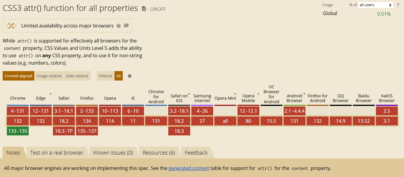
content: attr(data-attr);
--something: attr(data-attr);
--something: attr(data-attr type(<color>));
--something: attr(data-attr type(<color>), tomato);
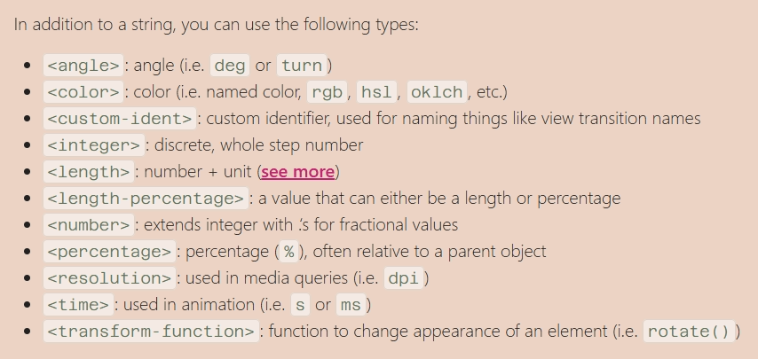
--something: attr(id type(<custom-ident>), tomato);
attr() grid
attr() charts
attr() rating
Auto view-transition-name with attr() and type(<custom-ident>)
New capabilities for attr() - Una Kravets